A Premium Brand into a High Performing Digital Experience
Delivered a responsive, user friendly website aligned with Pinnacle Oak’s brand vision, improving clarity, engagement, and providing a strong foundation for growth and enquiries
+35% increase in qualified enquiries within 90 days

Responsive Design
+42% increase in conversion rate
Industry
Wine Cooperage Agency
Client
Pinnacle Oak
Project
Web Design | Mobile Optimisation
Project Overview
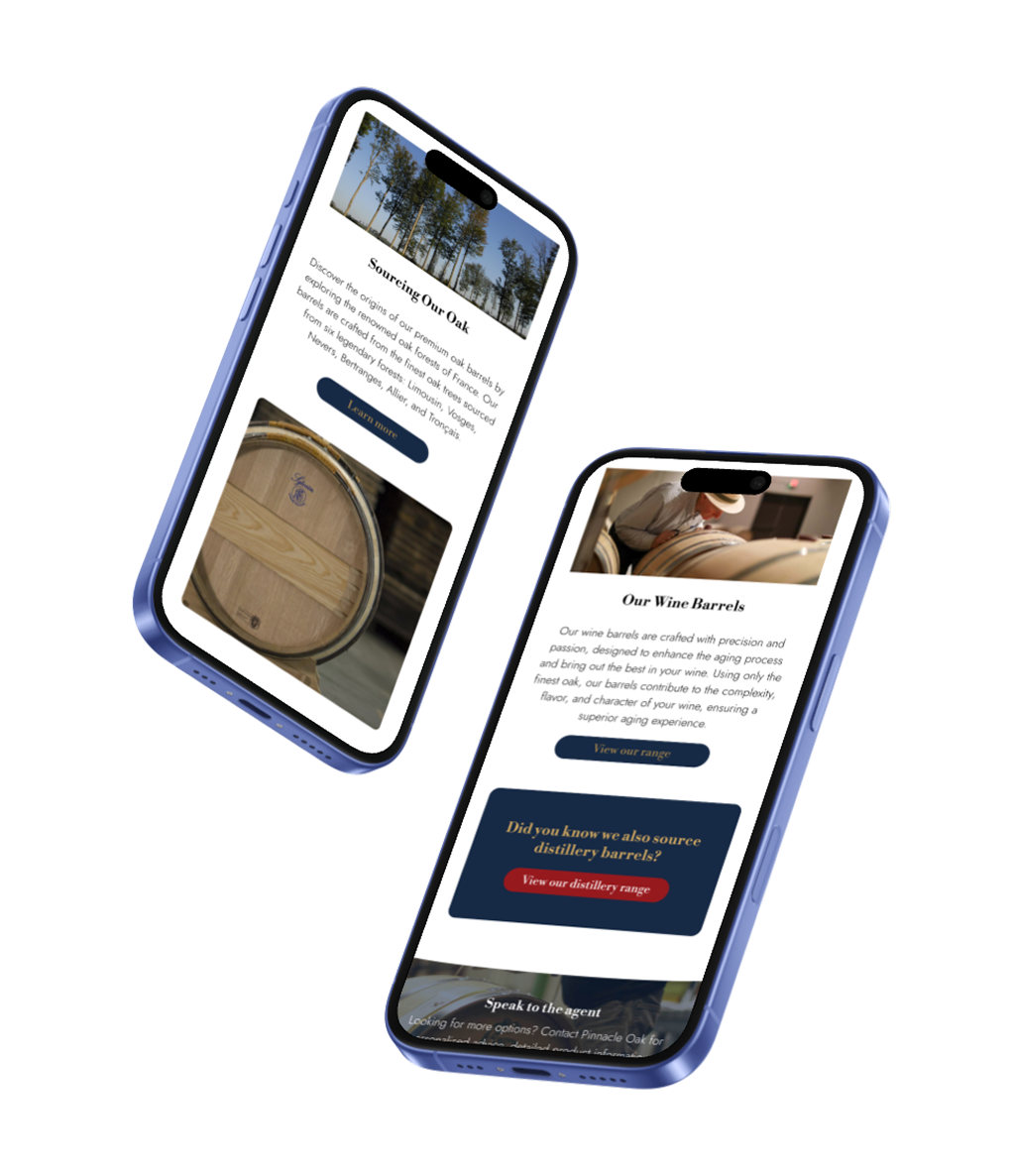
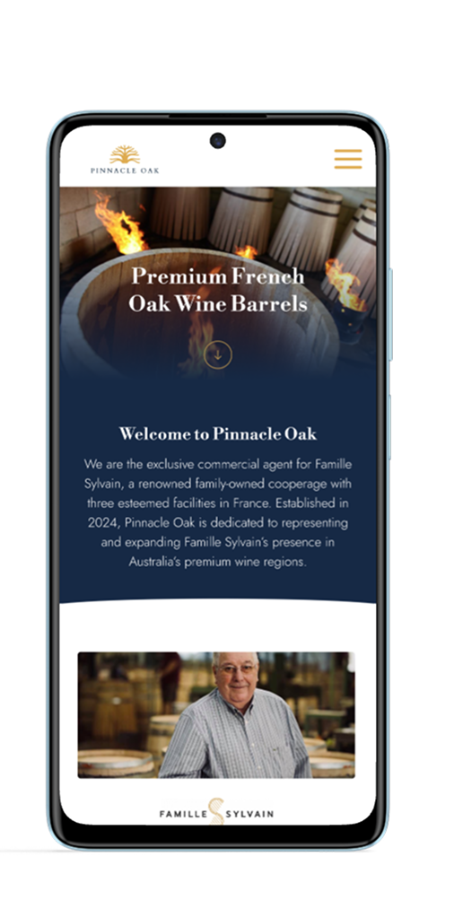
The Pinnacle Oak project aimed to design a premium website for a business showcasing high-quality French oak barrels from the prestigious Sylvain Famille Cooperage.
The client wanted a website that conveyed the craftsmanship and heritage of Sylvain barrels while enhancing the user experience. The project involved a clean, sophisticated UX/UI design with a focus on showcasing the barrels as a luxury product for wineries and distilleries.
Process
User research
Competitor Analysis
Persona & Journey Map
Branding Workshop
UX & UI Design
Project Management
Usability testing
Deliverables
Branding
Design System
Wireframes
User Interfaces
Prototypes
Responsive app design
SEO Optimisation


The Challenge
Pinnacle Oak needed to establish a credible digital presence from the ground up clarifying complex French oak barrel information while building trust in a traditionally offline, word of mouth industry.
The challenge was to create a UX driven platform that educates users, strengthens brand positioning, and drives qualified enquiries from day one.
UX Strategy
Our UX research revealed key opportunities: Many companies fail to provide specific oak origins and clear oak barrel details.
Additionally, mobile optimisation is lacking, which is critical since wineries operate in the field rather than at a desk.
As a startup, strong SEO is essential for visibility, and building trust through an ongoing relationship with users is a top priority


Mobile optimisation
Brand identity


Clear information
SEO & visibility
A UX research workshop covering Competitive Analysis, Heuristic Evaluation, and SWOT Analysis, along with Persona development and User Journey Mapping.
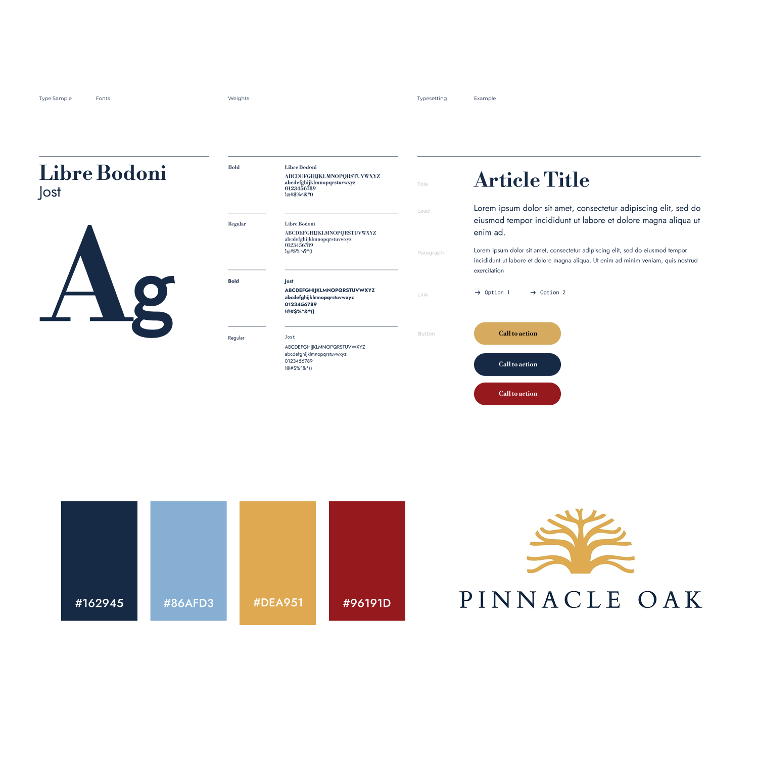
Design System
The Pinnacle Oak design system embodies sophistication and timeless elegance, using a refined colour palette and classic typography to convey trust and prestige.
The colour scheme consists of deep navy for depth and reliability, gold for luxury and heritage, soft blue for balance, and rich red for a bold accent.
The typography combines Libre Bodoni for a refined, traditional feel with Jost for modern versatility, ensuring clarity and professionalism.
The design system seamlessly integrates these elements to create a cohesive and premium brand identity, reflecting Pinnacle Oak’s dedication to excellence.
Wireframe
Transforming user journey insights into information architectures that drive engagement, bringing ideas to life through low-fidelity design.


Prototype
Bringing visual design to life by transforming concepts into interactive, user-centric prototypes that bridge creativity and functionality.


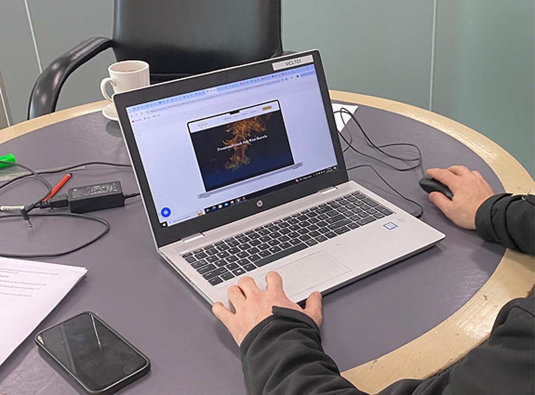
Usability Testing
During the user testing phase for Pinnacle Oak, we gathered valuable feedback to refine the website's design, functionality, and user experience. Participants tested key features, navigation flow, and overall usability, providing insights that helped us optimise the interface for clarity and efficiency.
The feedback highlighted areas for improvement, such as streamlining content layout and enhancing accessibility, ensuring a seamless and engaging experience for Pinnacle Oak's audience.
Identified friction points in navigation and product information structure
Optimised key user journeys to support higher engagement and conversions
Validated design decisions through iterative testing and feedback loops
Identified friction points in navigation and product information structure
Let’s Work Together
We create websites that don’t just look beautiful they’re designed to perform, turning user experience into real business results.