UX-Driven Web Design That Ranks and Converts
+27.9% engagement rate
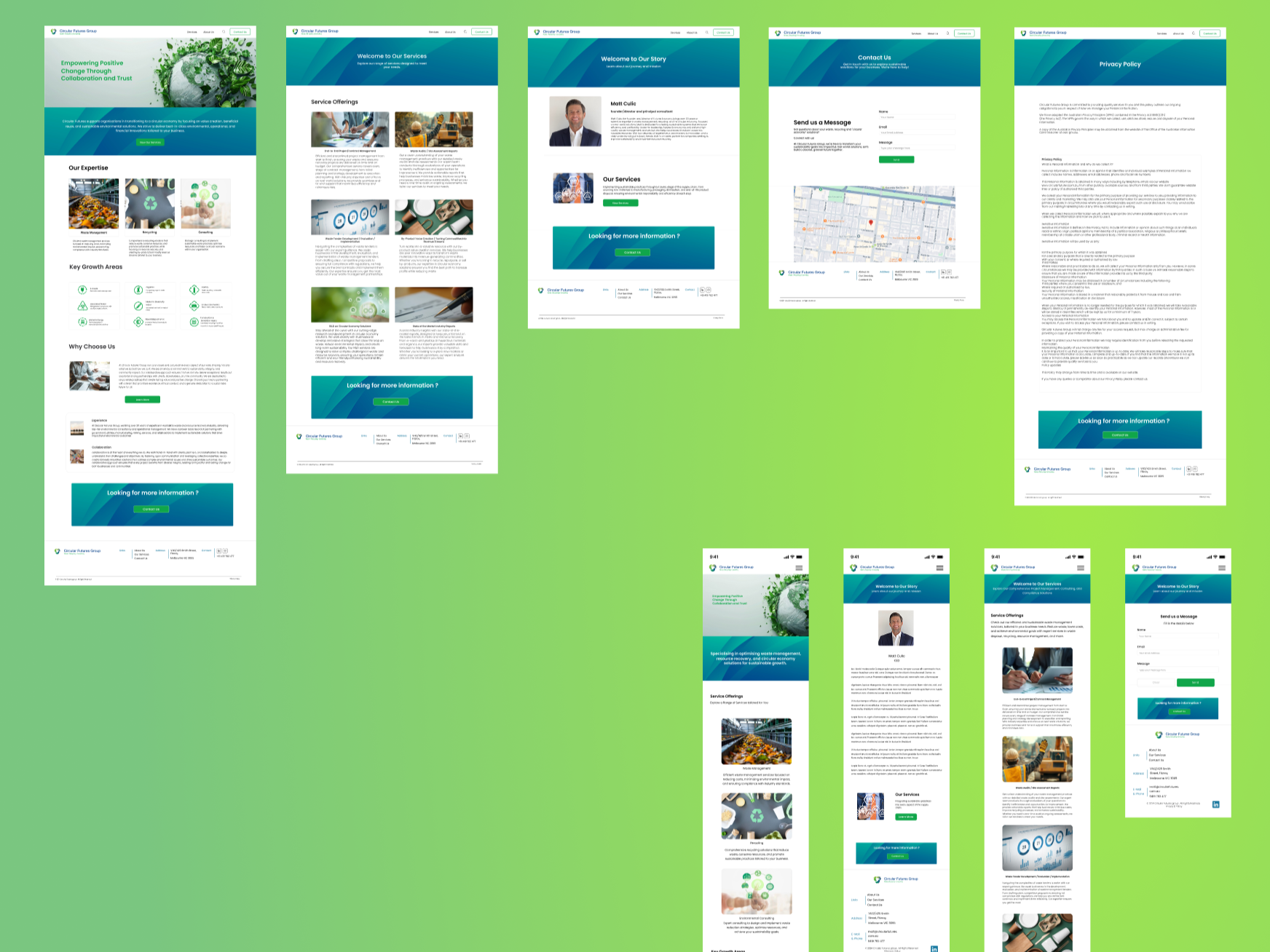
+155% increase in website visits
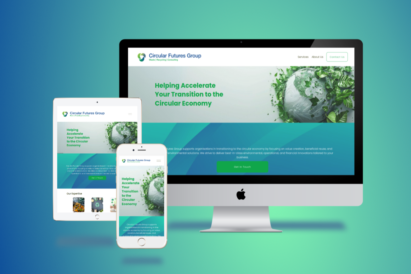
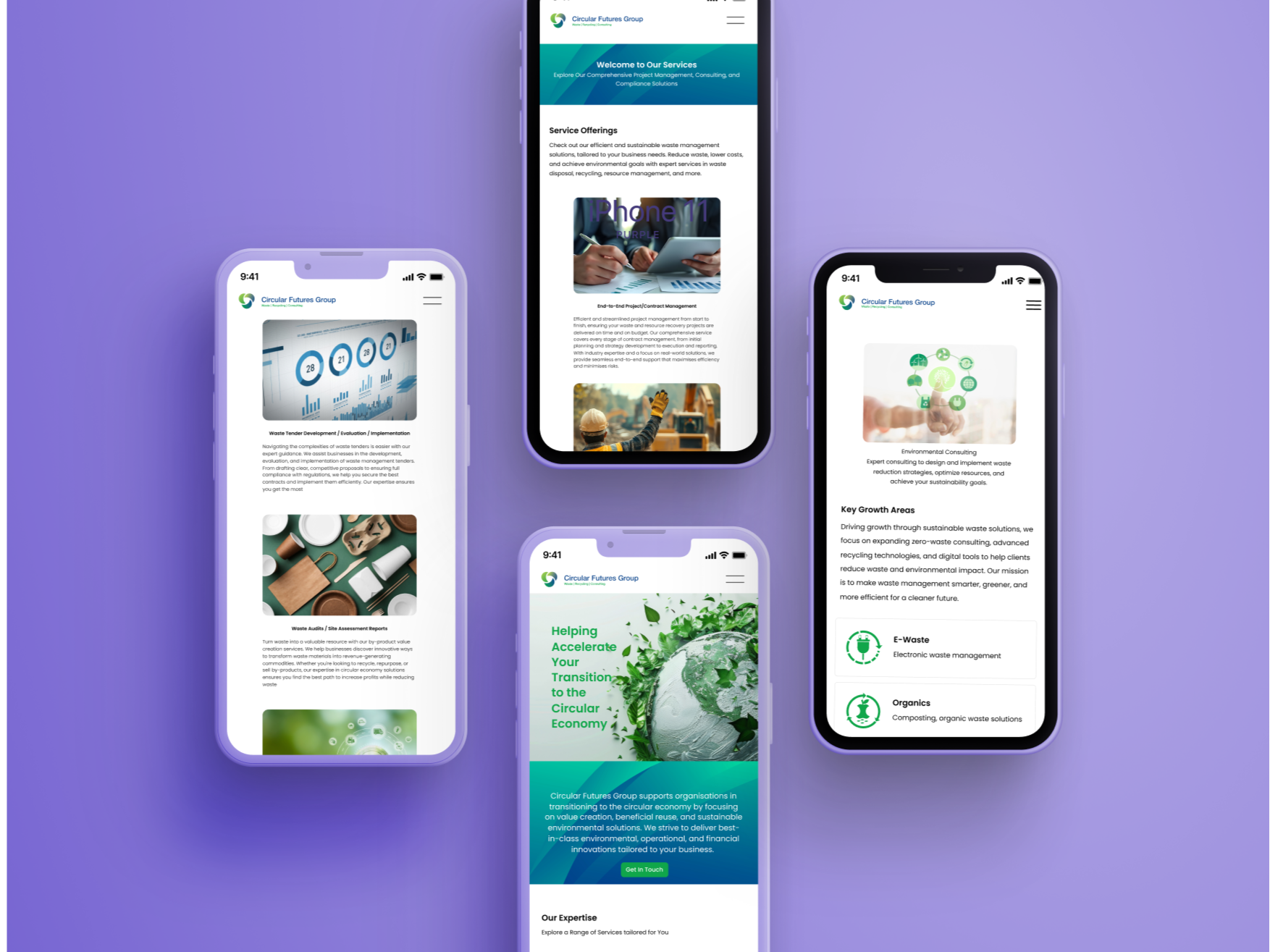
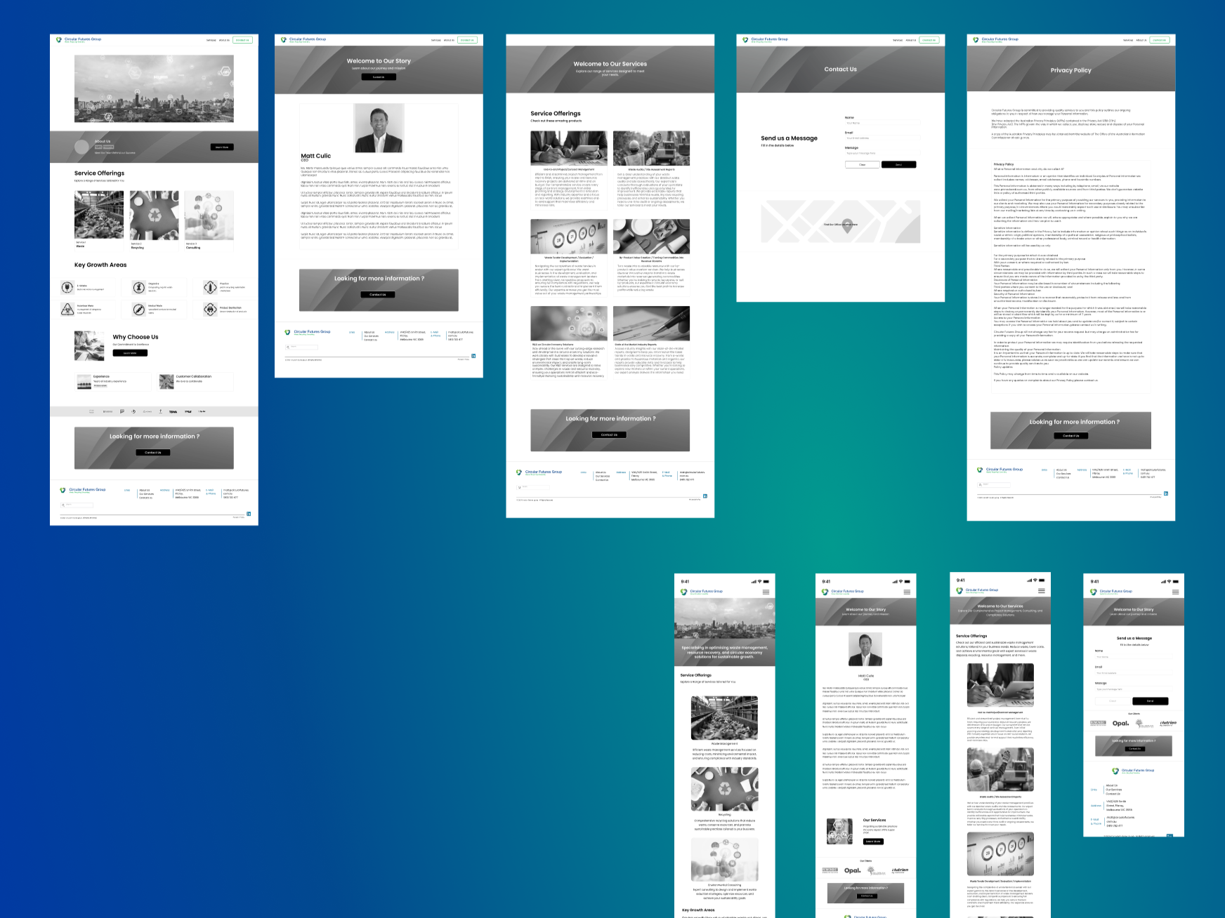
We delivered a cohesive brand identity and a user focused website that is easy to navigate and aligned with user intent.
The site was structured to support both SEO and conversion, with targeted content that improves visibility while remaining simple and accessible.
Since launch, the website has achieved measurable traction in search visibility and engagement
Industry
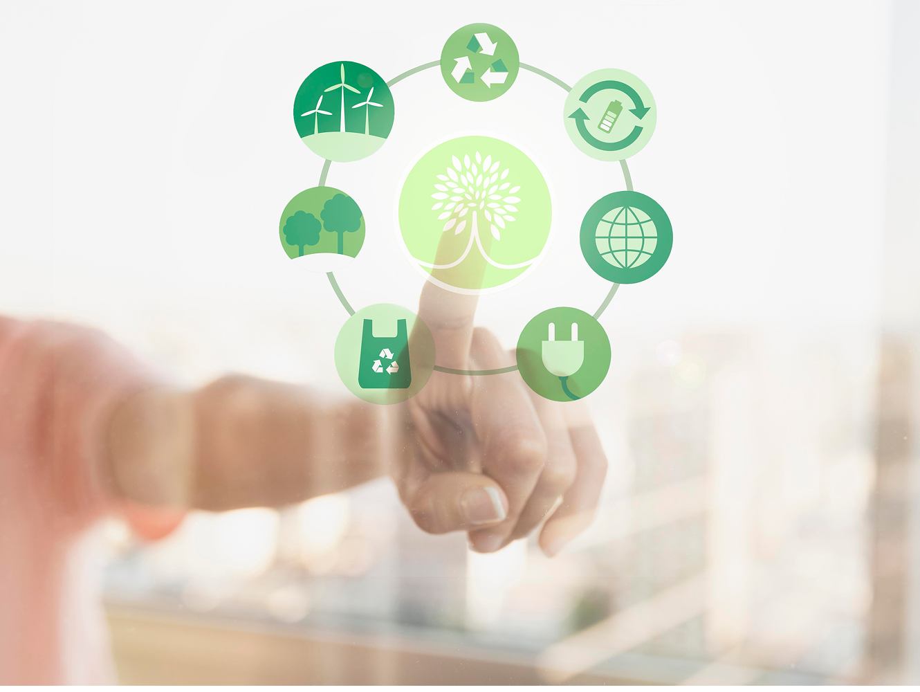
Waste Management
Client
Circular Futures Group
Project
Web Design | SEO | CRO


PROTOTYPE
TESTING
DEVELOP
WIREFRAME
DEFINE GOAL
RESEARCH
CONCEPT
The Challenge
Circular Future Group required a complete digital foundation with no existing brand, website, or SEO presence.
The challenge was to establish a credible identity from the ground up, simplify complex consulting services into a clear and intuitive experience, and design a user journey tailored to government, council, and industry stakeholders.
With no historical data or digital benchmarks, the system needed to be architected from first principles, defining both visibility and conversion pathways through structured UX, while maintaining a minimal, trust led interface.
UX Strategy
Through user interviews, we found that users were overwhelmed by excessive information and preferred quick, digestible insights. Our workshops and competitive analysis revealed that many competitor websites were not mobile-friendly and had slow loading speeds. To address these challenges, our goal was to create a website for Circular Futures Group that prioritises SEO, establishes a strong brand voice and tone, and embraces a minimalistic design for a seamless user experience.
Simplified Information Delivery

Mobile Optimization, Performance & SEO

Strategic Branding, Effective Brand Tone & Voice
Research & workshop
With the goal of creating an effective website, our collaborative workshop began with competitive analysis, SEO research, and keyword strategy. We then developed user personas and mapped their journey to identify key interaction points, ensuring a user focused website layout.


Conceptualisation
The logo was crafted to reflect Circular Futures Group’s core values sustainability, recycling, and innovation. We focused on a clean, modern design that ensures easy reproduction across digital and print platforms.
The circular shape symbolizes continuity and the circular economy, while the chosen shades of green and blue represent environmental responsibility and trust.
By refining the typography and simplifying the visual elements, we created a cohesive brand identity that aligns with the website’s minimalistic aesthetic and strengthens brand recognition.

A clean, simple interface that gets straight to the point
Keyword strategy targeting high-intent terms
Clean, minimal UI to reinforce authority
Logical information hierarchy for fast scanning
Dedicated pathways for high-intent users
Testing & Iteration
We conducted structured usability testing to validate the UX against user behaviour and business objectives.
Insights from stakeholder feedback and navigation analysis informed iterative refinements across interface design, content clarity, and information hierarchy. This process reduced friction, strengthened comprehension of complex consulting services, and improved end-to-end usability across devices.
Each iteration refined the experience further, resulting in a more intuitive, accessible, and conversion-ready platform aligned with Circular Future Group’s strategic goals and target audiences
Let’s work together
We create websites that don’t just look beautiful they’re designed to perform, turning user experience into real business results.