Redesigned the website into a performance led digital experience
Organic traffic Increased by +22%
Conversion rate Increased by +3.5%
The previous Whistle Clean landing page resembled a consultancy website and did not clearly reflect the brand’s core offering.
We redesigned the visuals, headings, and messaging to better align with Whistle Clean’s identity and clearly communicate its services, while also implementing targeted SEO improvements.
As a result, the website achieved strong Google rankings for high-intent keywords in Melbourne’s cleaning industry, including multiple top 5 positions across office and commercial cleaning search terms. This also contributed to a CRO uplift, increasing monthly enquiries.
These improvements have enhanced the overall user experience and strengthened Whistle Clean’s position as a trusted and highly visible brand in its market.
Industry
Cleaning Services
Client
Whistle Clean
Project
Redesign Website | SEO | CRO


Define Goal
Concept
UX Strategy
Develop
Challenge
Whistle Clean Australia, a Melbourne-based commercial cleaning company, required a refreshed digital presence that better reflected its brand values and strengthened trust with potential clients.
The existing website did not clearly differentiate the brand from competitors and lacked a compelling user experience.
There was also an opportunity to improve SEO performance and more effectively communicate Whistle Clean’s commitment to quality, reliability, and sustainability.
UX Strategy
Mobile Optimisation
Discoverability & Navigation
Keyword Usage
Visual Appeal


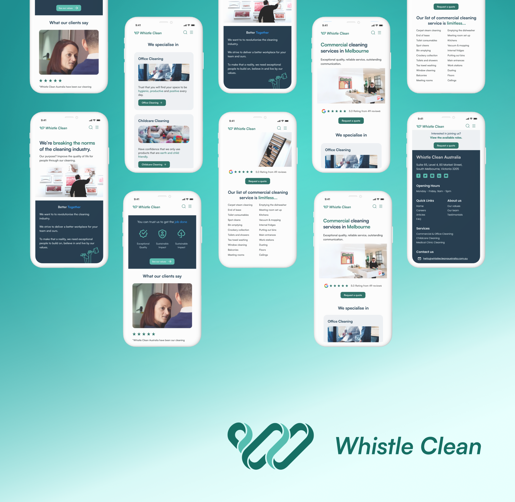
Redesigned the experience for mobile first users, ensuring fast load times, improved readability, and seamless navigation across all devices.
Integrated high intent location based keywords across key pages, headings, and metadata to improve search visibility and attract qualified organic traffic.
Rebuilt the page structure to prioritise clarity, placing key messages, services, and trust signals in a clear and scannable flow that guides users toward conversion.
Streamlined the site architecture to reduce friction, making it easier for users to find core services and move through the site intuitively.
Strengthened call to actions and service presentation to improve user engagement and increase enquiry rates.
Wireframe
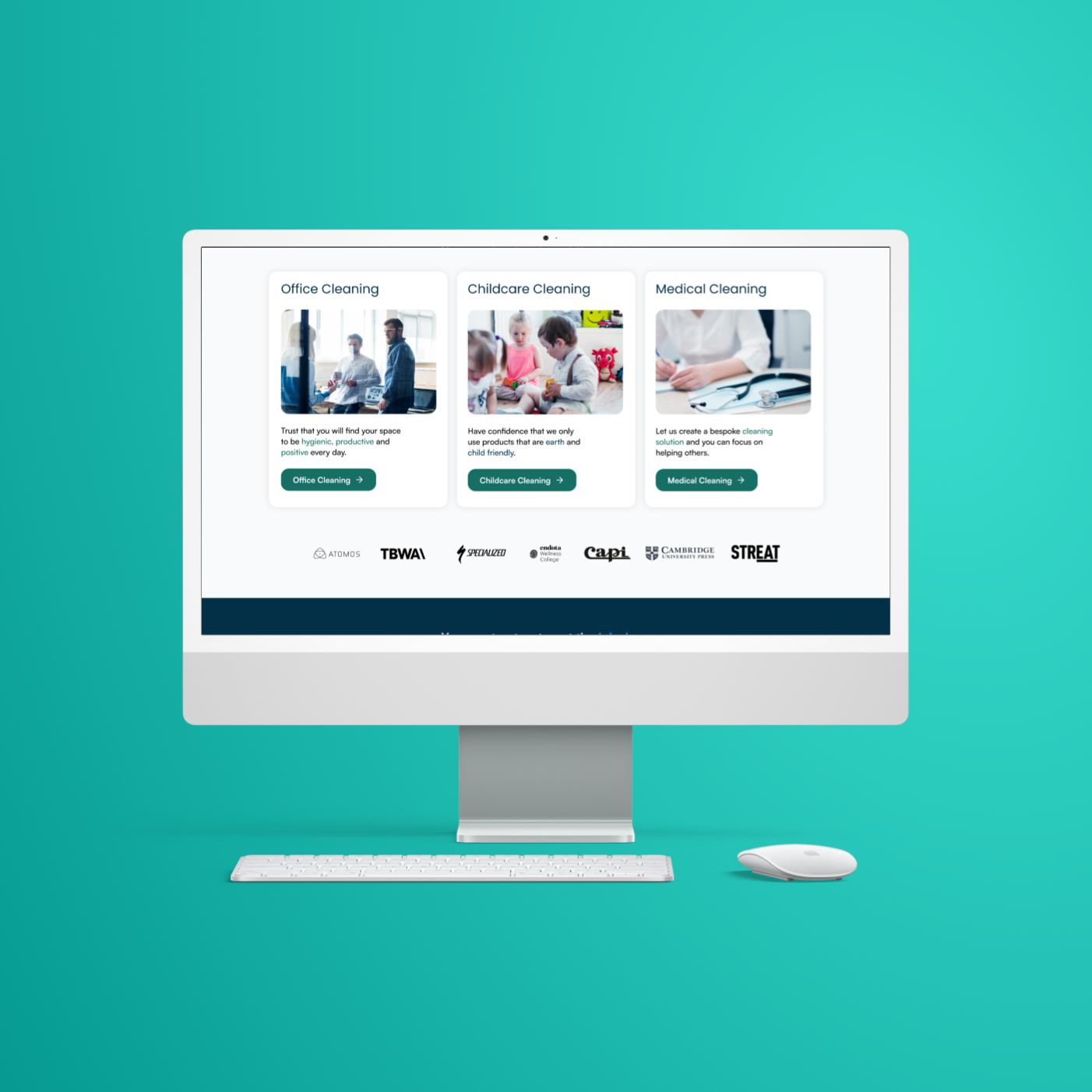
During the wireframing stage, we focused on a simplified information architecture to ensure easy navigation and quick access to key information. The interface and imagery were designed to effectively express the company’s values while enhancing the overall user experience.

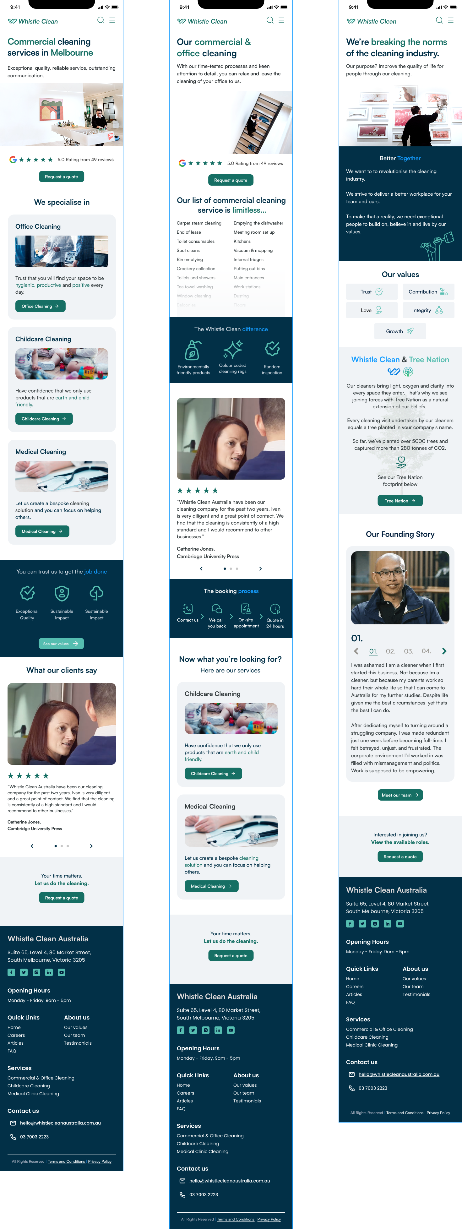
Visual Design

The Whistle Clean Australia project focused on enhancing the company's digital presence through a user-centric website redesign.
We carefully selected a color palette that embodies Whistle Clean's principles of love, trust, growth, integrity, and contribution.
By aligning visual elements with Whistle Clean's ethos, we crafted a digital experience that resonates with clients and reinforces the company's dedication to quality service and environmental stewardship.
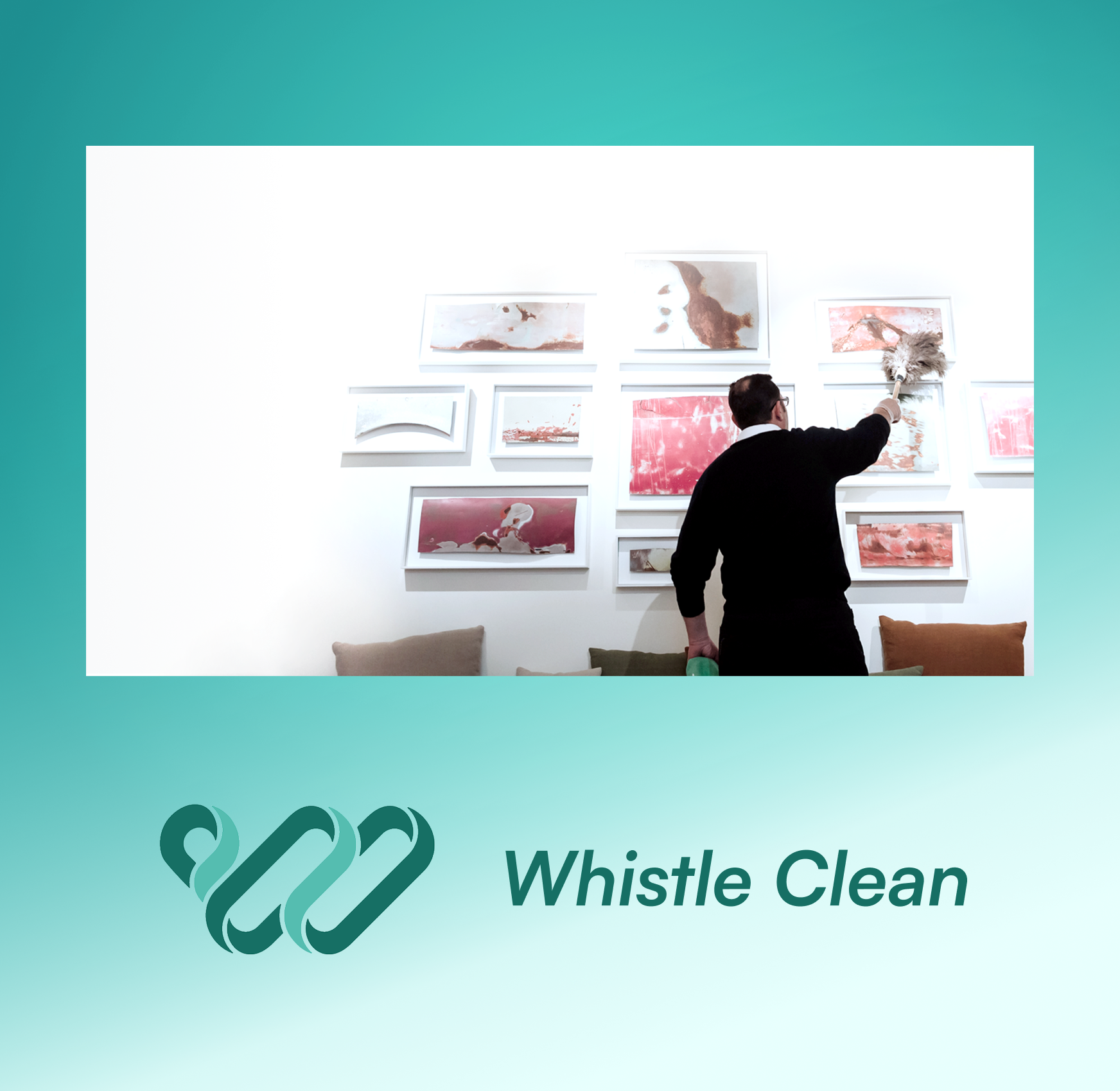
Prototype
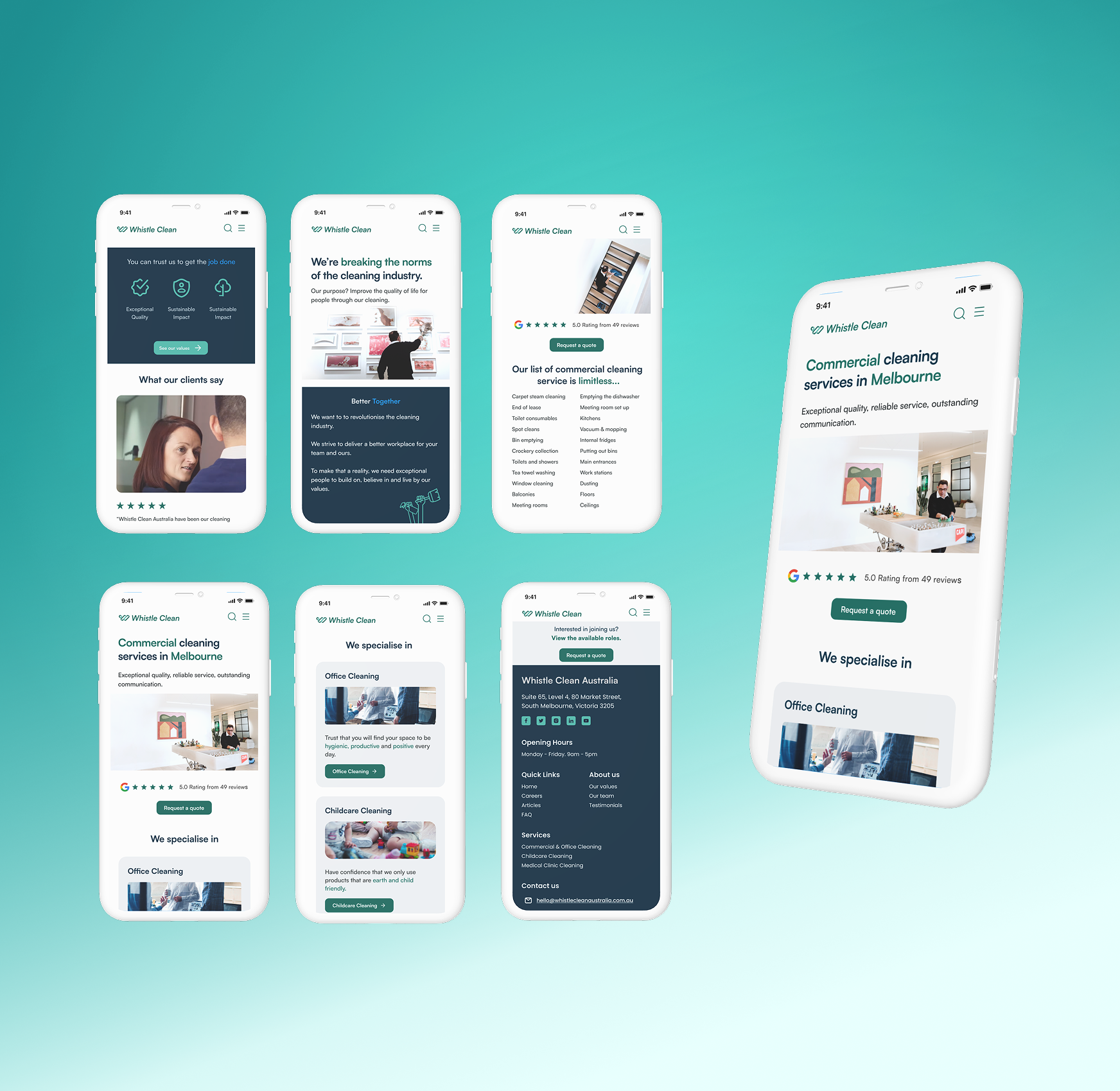
For the Whistle Clean prototype, we built a user-friendly, visually clean site that reflects the company’s commitment to quality, sustainability, and reliability.
We refined the visual language for a modern, standout interface and recommended an SEO strategy with key industry terms to boost visibility.
The result is a strategically optimised prototype aligned with the brand’s values.
(Before)

(After)

Develop and deliver
During the Deliver phase, we conducted user testing to gather valuable feedback and refine the prototype further.
Our findings highlighted the importance of prioritising accessibility and intuitive navigation to enhance the overall user experience.
Based on this feedback, we made necessary adjustments to ensure the site was user-friendly and inclusive.
The client was extremely pleased with the final outcome, recognising the improvements made and the strategic approach taken.
As a result, they proceeded with the development of the live site, bringing our design recommendations to life.
Let’s Work Together
We create websites that don’t just look beautiful they’re designed to perform, turning user experience into real business results.